
最近跟了一堂 Udemy 上的課,大概每次 30 分鐘帶你做一個小 project,覺得滿親切可人的所以想放鬆的時候就會跟著切一切。 不過跟著做有時候不一定可以想得很透徹,所以就有了這篇筆記,拆解過程中的每一步在幹嘛。覺得滿輕鬆愉快的。 希望閱讀的各位也可以看得輕鬆愉快。
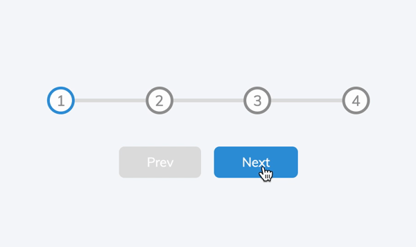
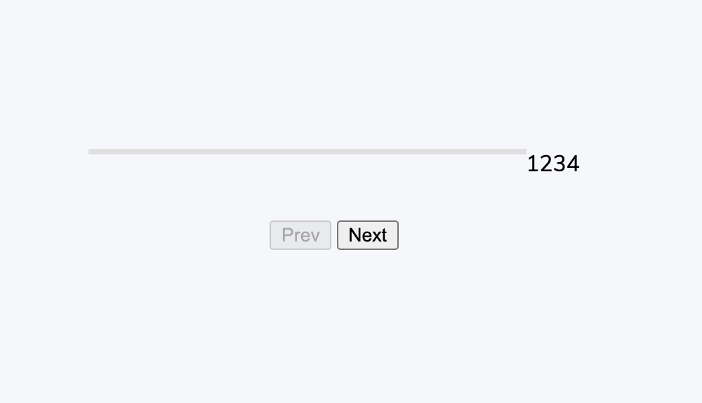
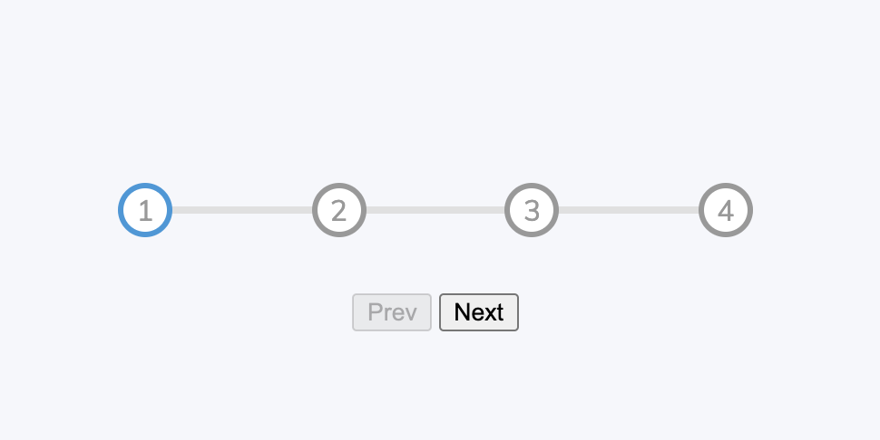
成果
HTML 部分
<!-- css 會在 header 裡面引用,這裡省略 -->
<body>
  <div class="container">

    <!-- 進度條的 container -->
    <div class="progress-container">
      <!-- 進度條本體 -->
      <div class="progress" id="progress"></div>
      <!-- 進度條的圈圈(Steps) -->
      <div class="circle active">1</div>
      <div class="circle">2</div>
      <div class="circle">3</div>
      <div class="circle">4</div>
    </div>

    <!-- 前進後退按鈕 -->
    <button class="btn" id="prev" disabled>Prev</button>
    <button class="btn" id="next">Next</button>

  </div>
  <!-- script 放在 body 尾巴 -->
  <script src="script.js"></script>
</body>
CSS 部分
基本版型
/* 引入字型 */
@import url('https://fonts.googleapis.com/css2?family=Muli&display=swap');

/* 給一個 scope 設定變數 */
:root{
  /* 已完成進度的顏色 */
  --line-border-fill: #3498db;

  /* 未完成進度的顏色 */
  --line-border-empty:#e0e0e0;
}

/* 初始化一些基本排版 */
*{
  box-sizing: border-box;
}

body{
  background-color: #f6f7fb;
  font-family: 'Muli', sans-serif;
  display: flex;
  align-items:center;
  justify-content: center;
  height: 100vh;
  overflow: hidden;
  margin: 0;
}
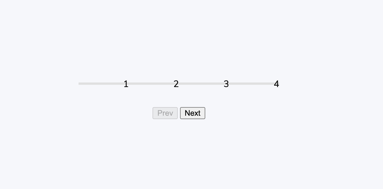
到這裡會長這樣。
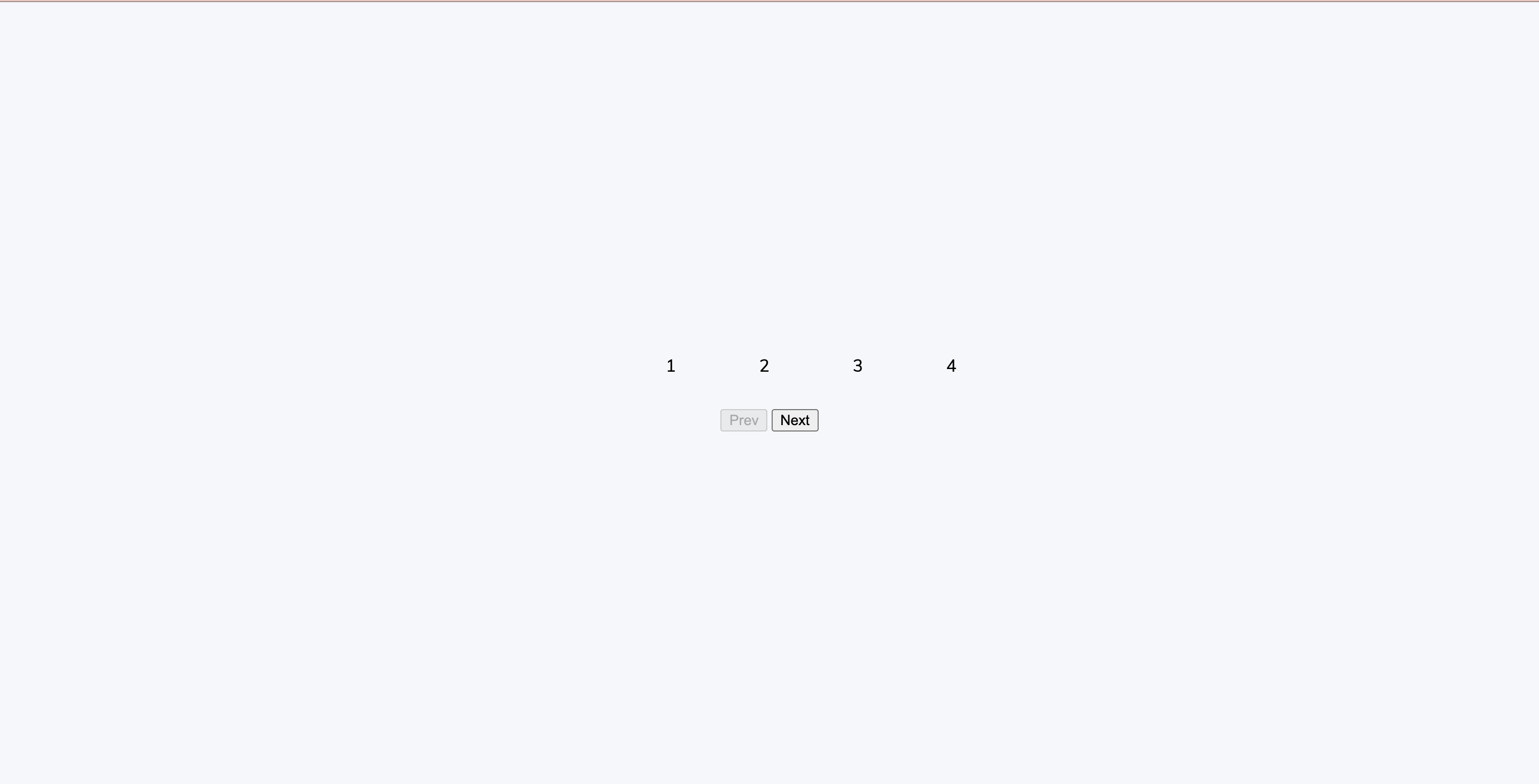
修改 container class
.container{
  text-align: center;
}
修改 Step 間距
.progress-container{
  /* 讓這個元素成為 flexbox 的 container */
  display: flex;

  /* 使用 space-between 使內部元素取得相同間距 */
  justify-content: space-between;

  /* 想要使用 relative-absolute,所以這裡放 relative */
  position: relative;

  margin-bottom:30px;
  max-width: 100%;
  width: 350px;
}
用偽元素 ::before 畫進度條的容器
先把一條線畫出來
.progress-container::before{
  /* 使用偽元素一定要有 content,如果沒有內容可以放空字串 */
  content:'';

  /* 這裡使用了事先定義的未完成進度顏色 */
  background-color: var(--line-border-empty);

  /* 進度條容器的長寬 */
  height: 4px;
  width:100%;
}
使用 relative-absolute 讓進度條容器和字重疊,然後用 z-index 讓它顯示在字的後面。
.progress-container::before{
  content:'';
  background-color: var( --line-border-empty);
  height: 4px;
  width:100%;

  /* 以下是新增的 */
  /* 使用 relative-absolute */
  position: absolute;

  /* 調整 absolute 的位置到高度的 50%,距離左側 0 */
  top: 50%;
  left: 0;

  /* 因為這個元素自身的寬度,所以需要往上調自身寬度的 50% 回來才會回到正中間 */
  transform: translateY(-50%);

  /* 顯示到數字的後面 */
  z-index: -1;
}
到這裡進度條容器完成
進度條本體
.progress{
/* 這裡使用了事先定義的已完成進度顏色 */
background-color: var(--line-border-fill);
/* height 一樣 4px,width在切版時可以先放成 50%,調整好再改回進度為 0% 的狀態 */
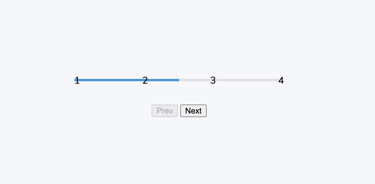
/* 附圖為 50% 的狀態 */
height: 4px;
width: 0%;
/* 一樣使用 relative-absolute把已完成進度條也放到正確位置上 */
position: absolute;
top: 50%;
left: 0;
transform: translateY(-50%);
z-index: -1;
/* 這裡用 transition 做出一點動畫效果*/
transition: 0.4s ease;
}
進度為 50% 的狀態
畫 Step 的圈圈
.circle{
  /* 底色白色,文字顏色和邊框灰色 */
  background-color: #fff;
  color:#999;
  border:3px solid #999;

  /* 把元素畫成寬高為 30px 的圓形 */
  border-radius:50%;
  height: 30px;
  width: 30px;

  /* 用 flexbox 排版把文字放到正中間 */
  display:flex;
  align-items: center;
  justify-content: center;

  /* 一樣加上動畫效果 */
  transition: 0.4s ease;
}
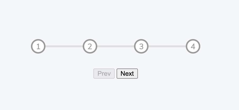
到這裡,進度改回 0% 的狀態
達到進度的 circle
這裡使用 .active 作為是否達到進度的判斷,所以只要找有 .active 的 .circle 改變顏色成已完成進度顏色就可以了。
.circle.active{
  border-color: var(--line-border-fill);
}
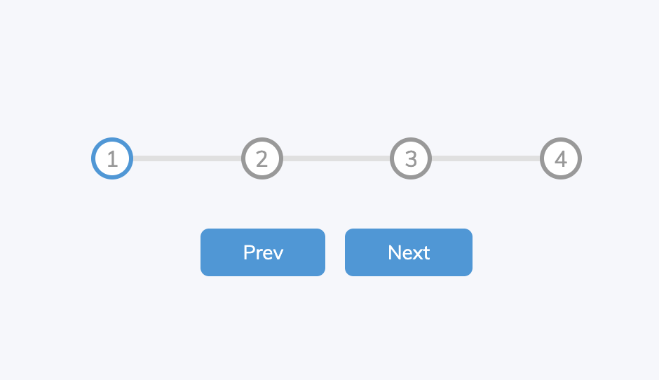
修改按鈕樣式
.btn{
  background-color:var(--line-border-fill);
  color:#fff;
  border:0;
  border-radius: 6px;
  cursor: pointer;
  font-family: inherit;
  padding: 8px 30px;
  margin:5px;
  font-size: 14px;
}
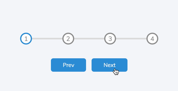
按鈕點擊效果
按下去時變小一點點,就有按鈕被按的感覺
.btn:active{
  transform:scale(0.98);
}
然後拿掉要按鈕被按時的框線
.btn:focus{
  outline: 0;
}
變成這樣
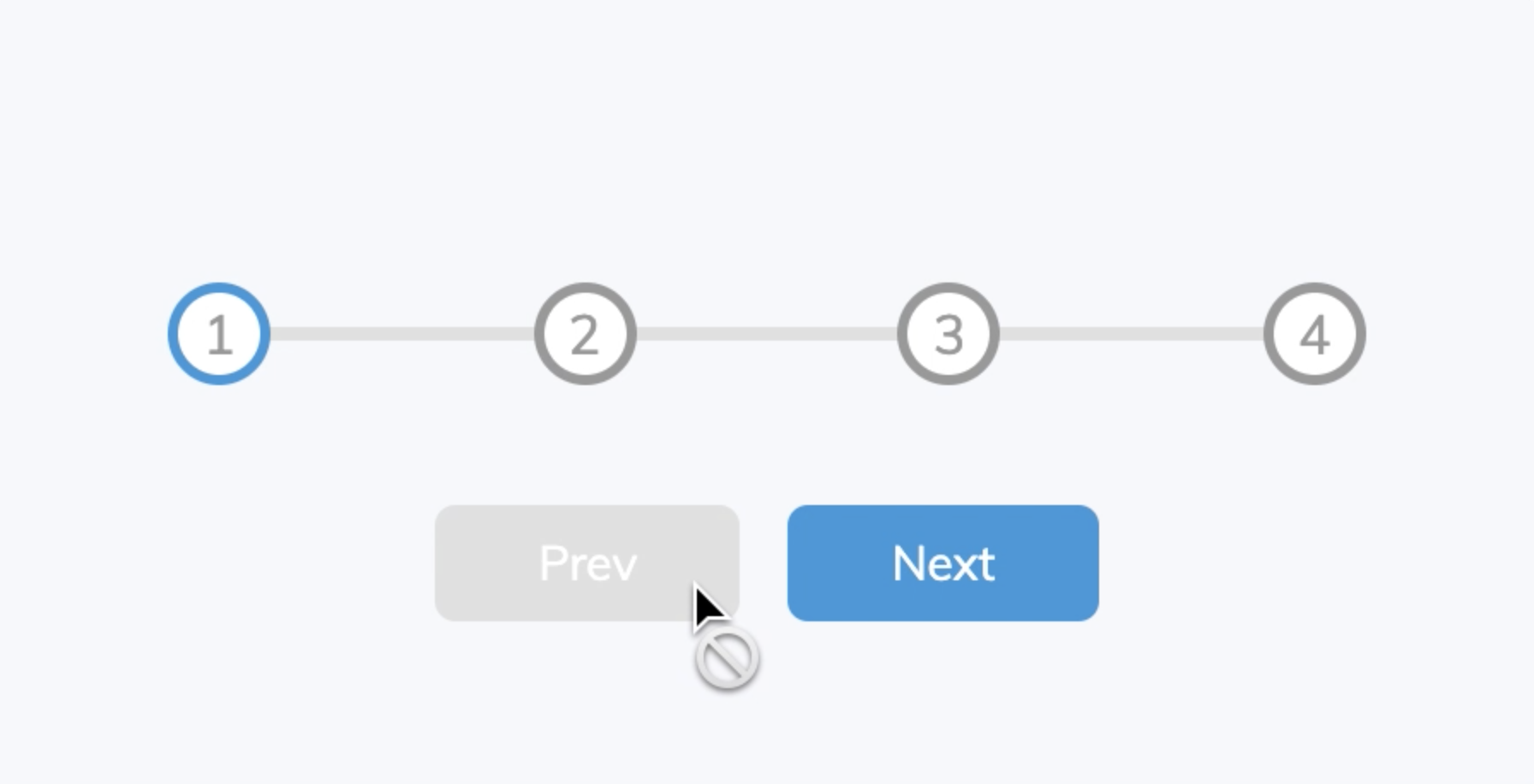
按鈕無效時
.btn:disabled{
  background-color: var(--line-border-empty);
  cursor:not-allowed;
}
 到這裡 CSS 結束,進入 JS。
JS
首先,把我們想要的元素抓出來放進變數
選元素
//進度條
const process = document.getElementById('process');
// 前進按鈕
const prev = document.getElementById('prev');
// 後退按鈕
const next = document.getElementById('next');
// 進度圈圈
const circles = document.querySelectorAll('.circle');
圈圈不只一個,所以用 querySelectorAll 來抓 .circle class 的所有東西。
前進後退
前進按鈕
// 首先設定變數現在的階段 currentActive 為 1
let currentActive = 1

//每當前進紐被點擊的時候, currentActive 就加一(往前進一步)
next.addEventListener('click',()=>{
  currentActive++

  //判斷還能不能前進,如果不能前進了,就設為最大步數,也就是圈圈的個數
  if (currentActive > circles.length){
    currentActive = circles.length
  }
  // 可以用 console.log 檢視 currentActive 有沒有照我們想要的跑
  // console.log(currentActive)

  // 更新狀態(函式內容還沒定義)
  update()
})
後退按鈕
//每當後退紐被點擊的時候, currentActive 就減一(往後退一步)
prev.addEventListener('click',()=>{
  currentActive--

  //判斷還能不能前進,如果不能後退了,就設為初始值,也就是1
  if (currentActive < 1){
    currentActive = 1
  }
  // console.log(currentActive)

  // 更新狀態(函式內容還沒定義)
  update()
})
定義 update 函式
這個函式要做三件事:
- 更新 .circle 元素的 .active class
- 更新進度條元素的長度
- 更新按鈕狀態
function update(){
  // 第一件事:更新 .circle 元素的 .active class

  //遍歷一遍 circles
  circles.forEach((circle,idx)=>{

    //如果現在的 circle 的 index 比 進度(currentActive) 小的話,就是一個已完成進度,加上 active
    if(idx < currentActive){
      circle.classList.add('active')
    }else{
      //否則這個 circle 就是一個未完成進度,拿掉 active
      circle.classList.remove('active')
    }
  })

  // 第二件事:更新進度條元素的長度
  // 因為是進度條的長度,所以我們用(已完成距離(進度-1))/間隔數(圈圈總數-1) *100 取得長度百分比
  length = ((currentActive-1)/(circles.length-1)) * 100
  // 把單位加回去
  progress.style.width = length + "%"


  // 第三件事:更新按鈕狀態
  if(currentActive === 1){
    // 如果還在第一步,那就不能後退,後退鈕 disable
    prev.disabled = true
  }else if(currentActive === circles.length){
    // 如果已經到了最後一步,那就不能前進,前進鈕 disable
    next.disabled = true
  }else{
    // 如果都不是的話,就不用 disable,disabled 設為 false
    prev.disabled = false
    next.disabled = false
  }
}
完成!
今天的拆解之後一有一些地方自己進行了一些微調,原本檢視進度的地方是
const active = document.querySelectorAll('.active')
progress.style.width = ((currentActive-1)/(circles.length-1)) * 100 + "%"
我覺得不需要再多一個變數,就改成了現在的版本。如果有人知道其中的深意歡迎留言和我分享,我會很開心。
另外判斷的部分我可能也不會採用先加了在判斷是否可以前進,但目前懶得改,如果你也和我是同一派,歡迎下面留言和我分享。
以上就是今天的小練習。希望你也看得開心。 我們下次見。